
The Challenge
Create a range of cohesive packaging and brand guidelines to bring the Oreo Ice Cream range together. Maintaining existing core Oreo brand assets and values whilst giving Oreo Ice Cream its own unique identity.
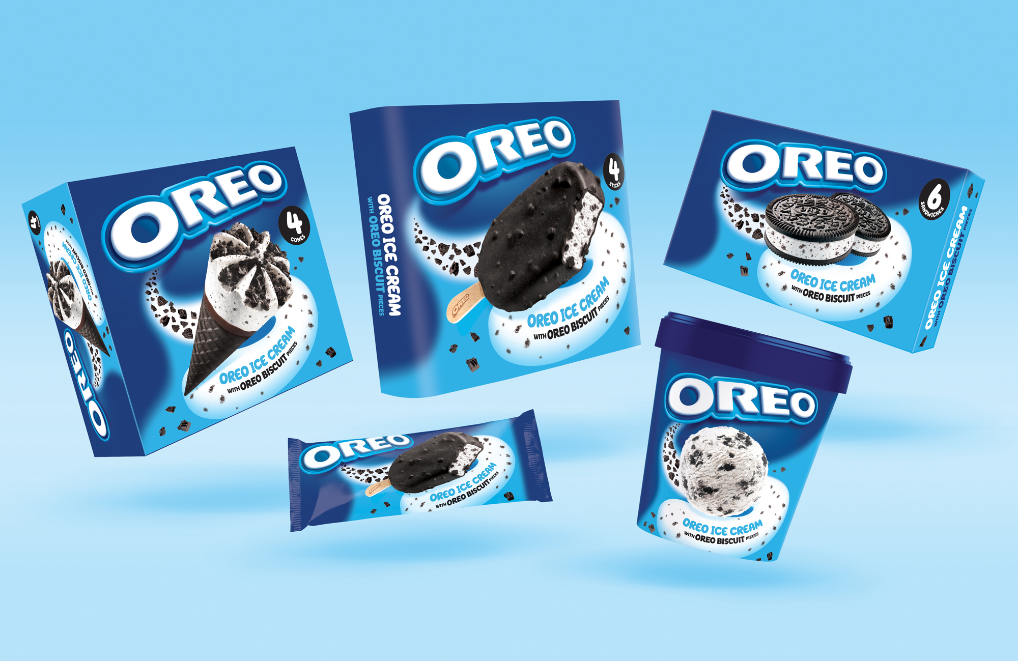
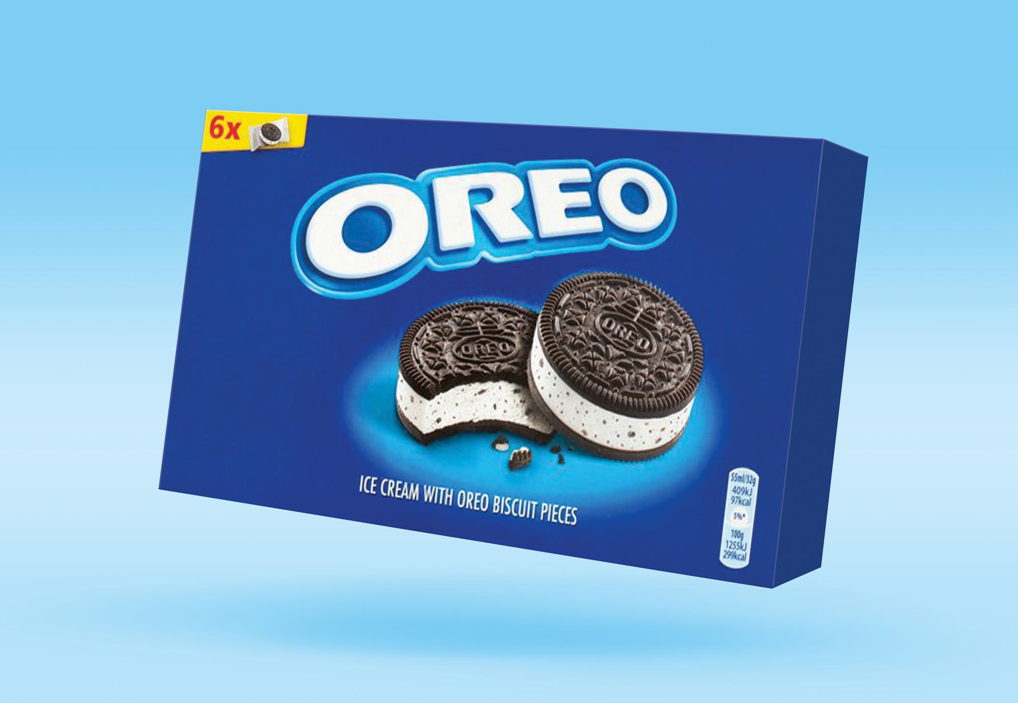
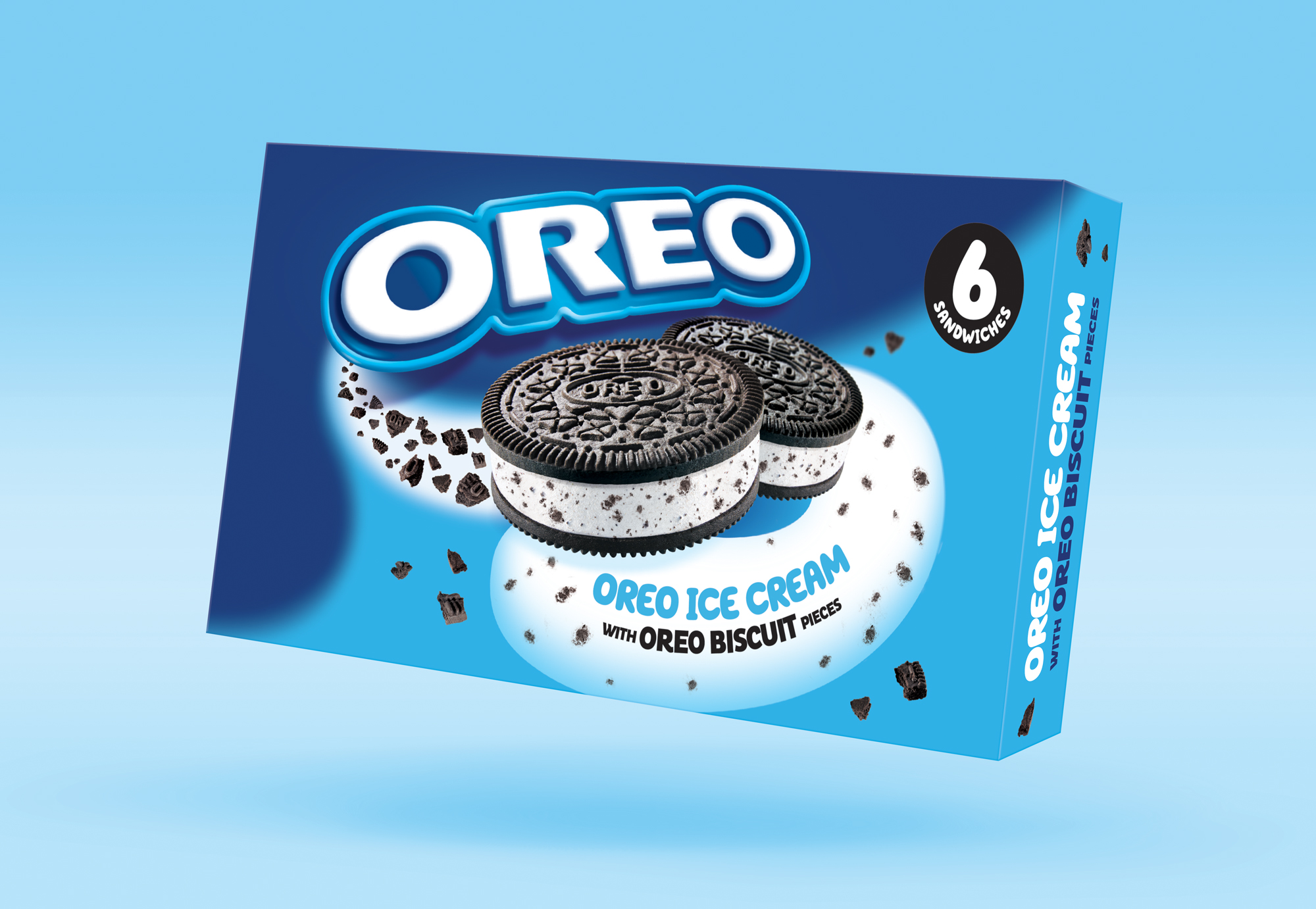
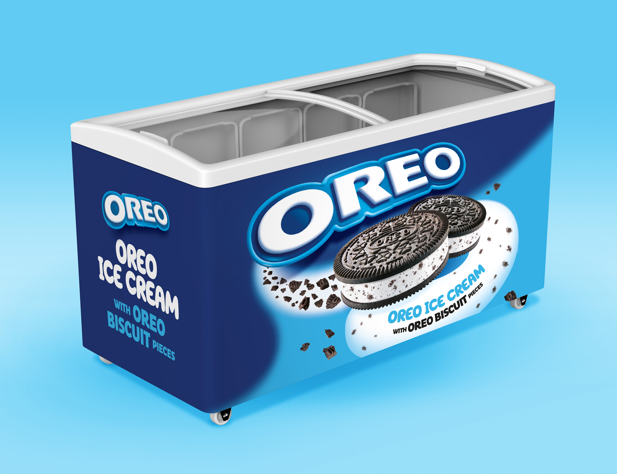
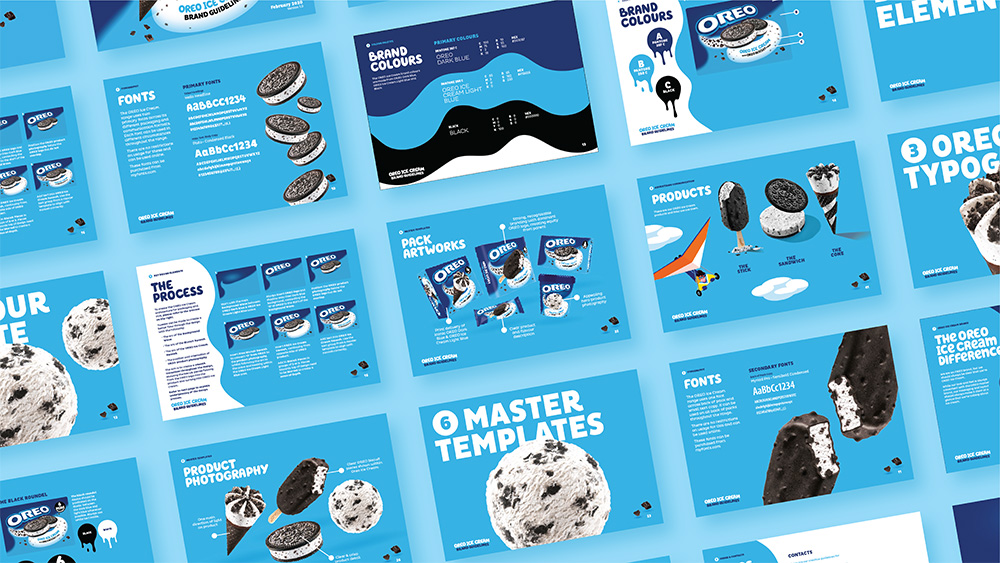
The Result
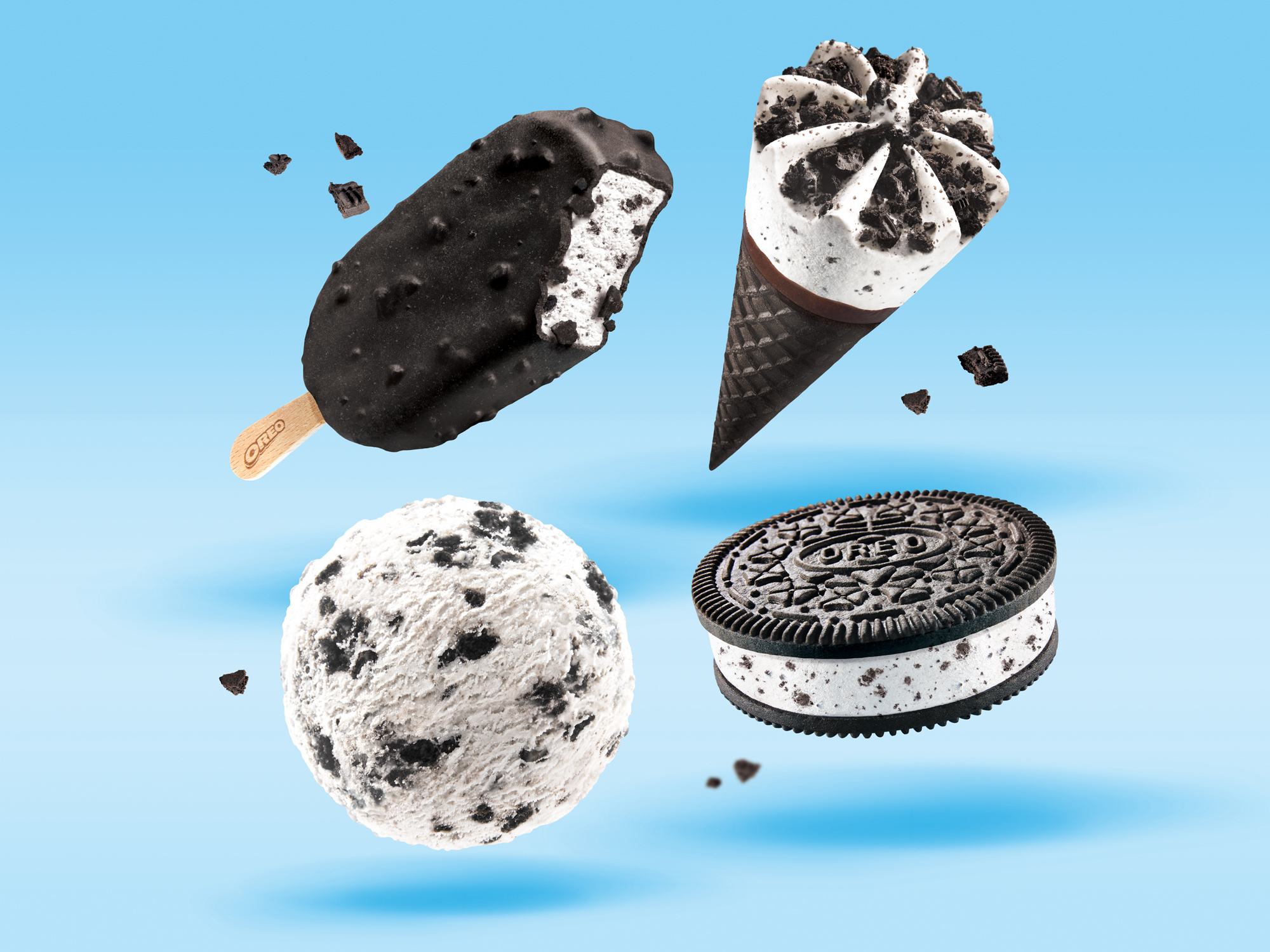
The playful pack architecture focuses on the Oreo crumb transforming into the Oreo ice cream, heroing the new product photography in its transition. A bubbly font now accompanies the pack descriptor, highlighting the new sub-brand, whilst the range colours are now predominantly lighter. Using an icy fresh blue and white to make the new product illustration stand out, the range is given its own sense of identity whilst adhering to the existing Oreo core brand values and assets.