The Challenge
A top-tier UK food powerhouse set its sights on revolutionising the poultry market with the launch of an exciting new flavoured turkey brand, responding to the surging demand for healthier, more diverse protein options.
Unveiling the untapped potential of turkey, often dismissed as bland, the mission was to dazzle taste buds and shatter existing culinary stereotypes, making turkey the go-to choice for an adventurous and health-conscious generation.
Art Direction
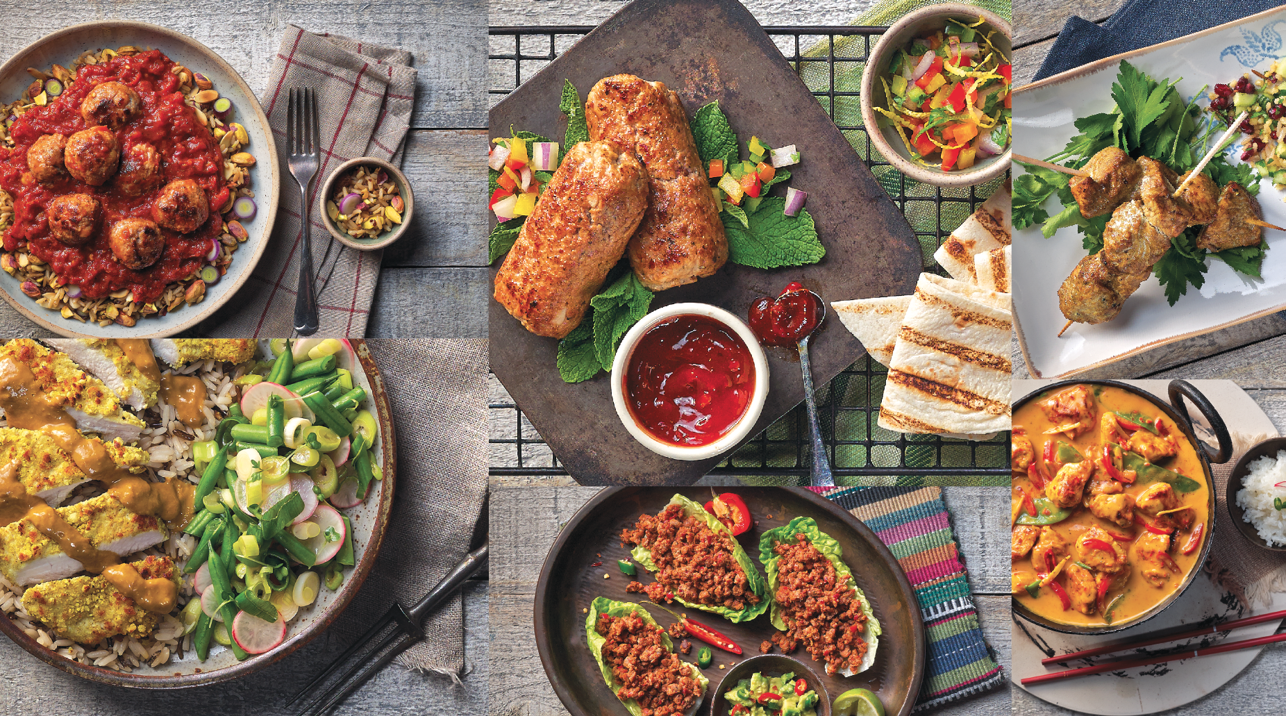
Food photography was needed for back-of-pack and to create a bank of assets for future use. A shoot was undertaken to reflect the brand proposition and create balance between delicious and healthy, using rustic settings and props to synergise with the textured nature of the packaging design assets.
The Result
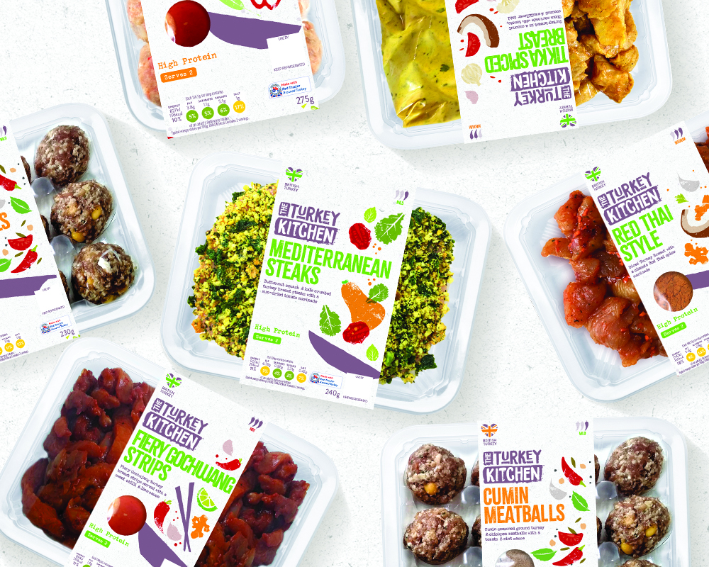
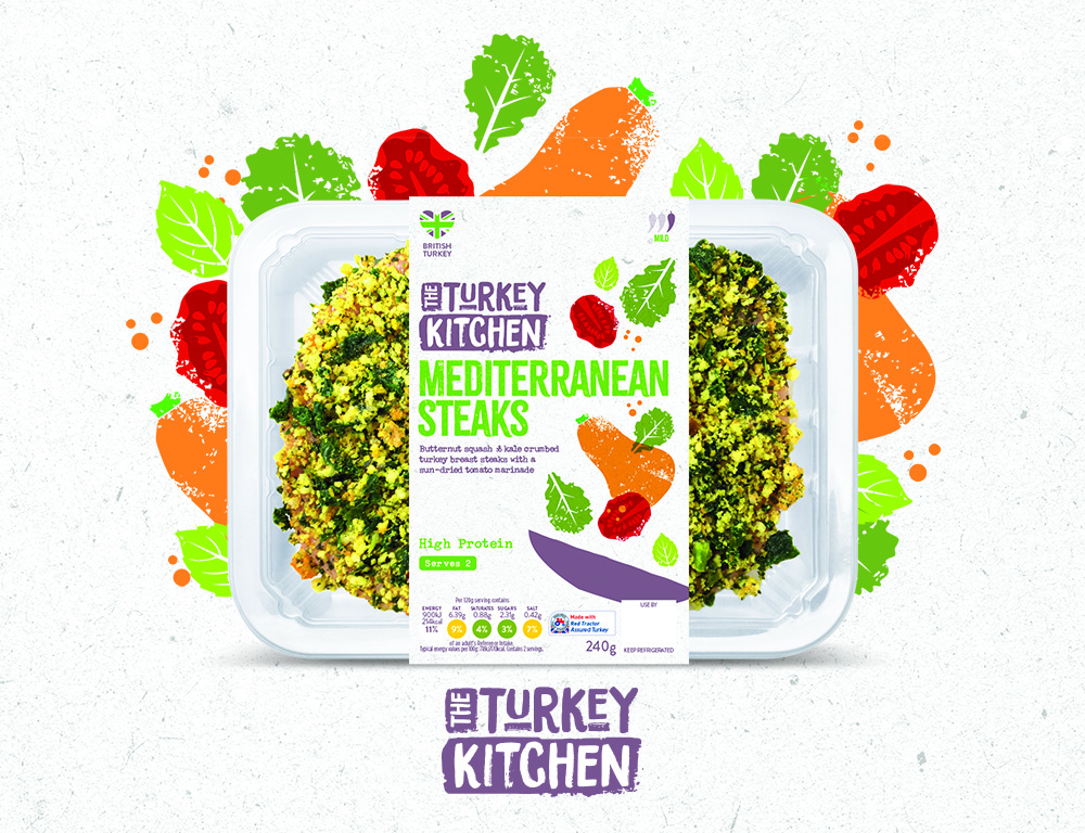
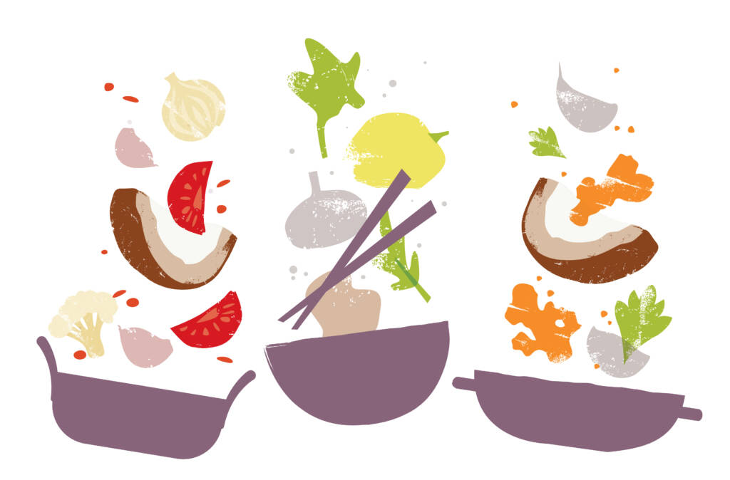
Turkey Kitchen is crafted to stir excitement and culinary exploration, moving away from the notion of processed foods towards the artistry of chefs at work. Its design features a textured white background that signifies the product’s low calorie content and freshness, enhanced by craft print illustrations that mimic a chef’s playful touch, scattering ingredients above each dish.
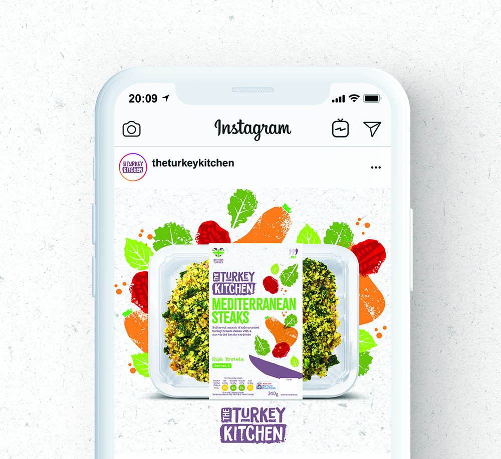
This artistic approach, combined with the vivid colours of the ingredients, not only makes the packaging stand out but also enhances the product’s appeal by highlighting its taste. The overall handmade, rough-and-ready design aesthetic reinforces the authenticity of the culinary experience, aiming to convince consumers of turkey’s health benefits and delicious taste.
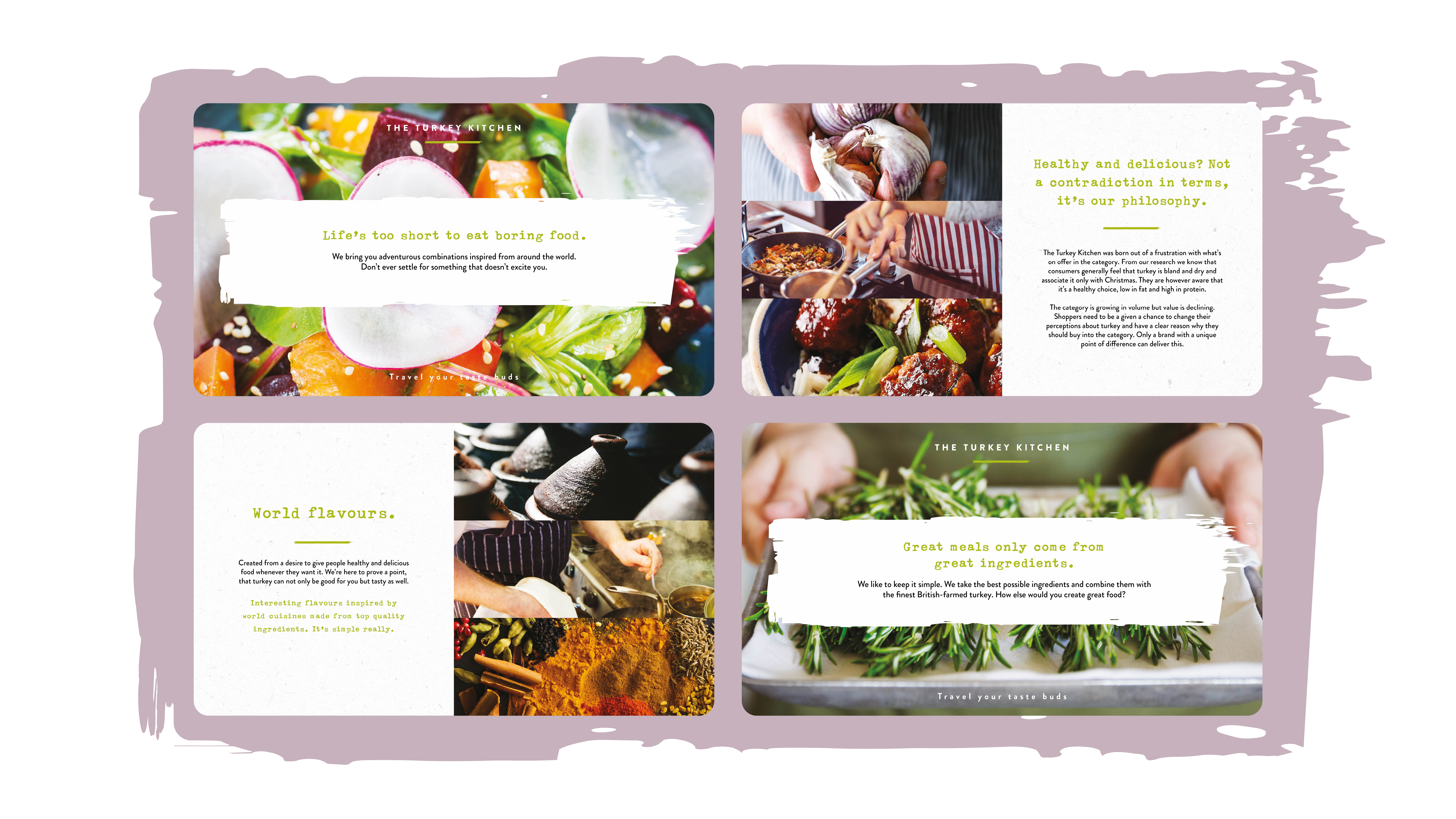
Alternative Propositions
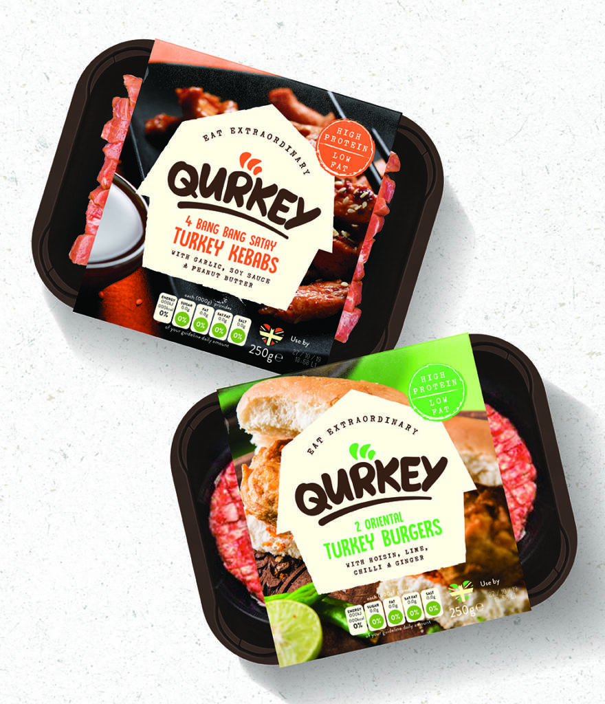
Throughout the project there were a number of alternative propositions including brand name, brand story and pack design, each one with its own unique identity and story to tell.
