

The Challenge
The mission was to modernise the Just Brazils brand, making it resonate with the tastes of today’s market. The goal was to refresh its image, appealing to consumers seeking both tradition and contemporary flair.
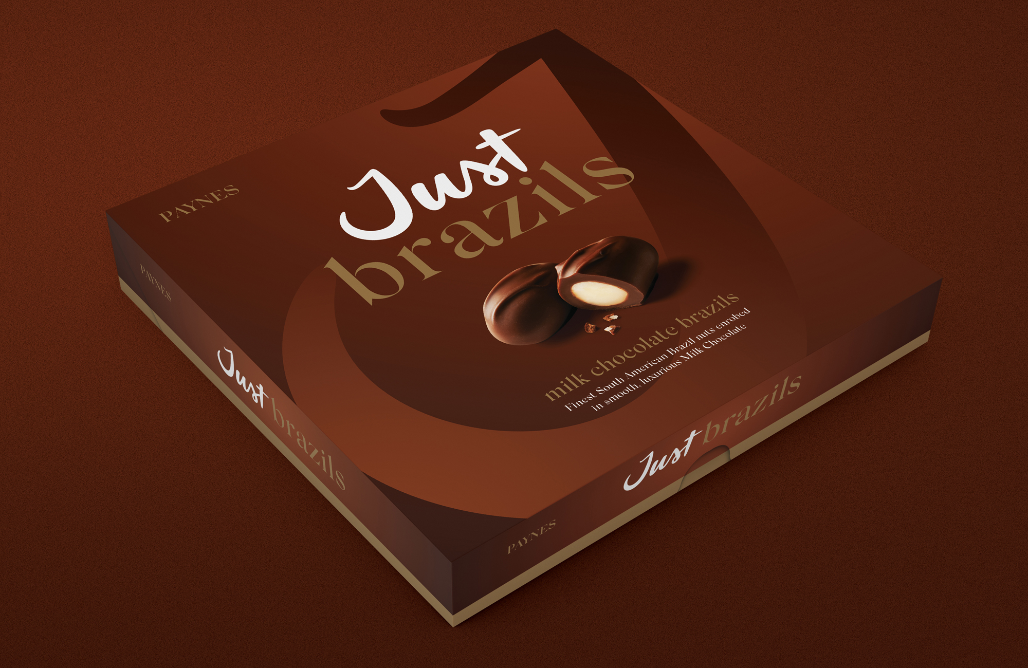
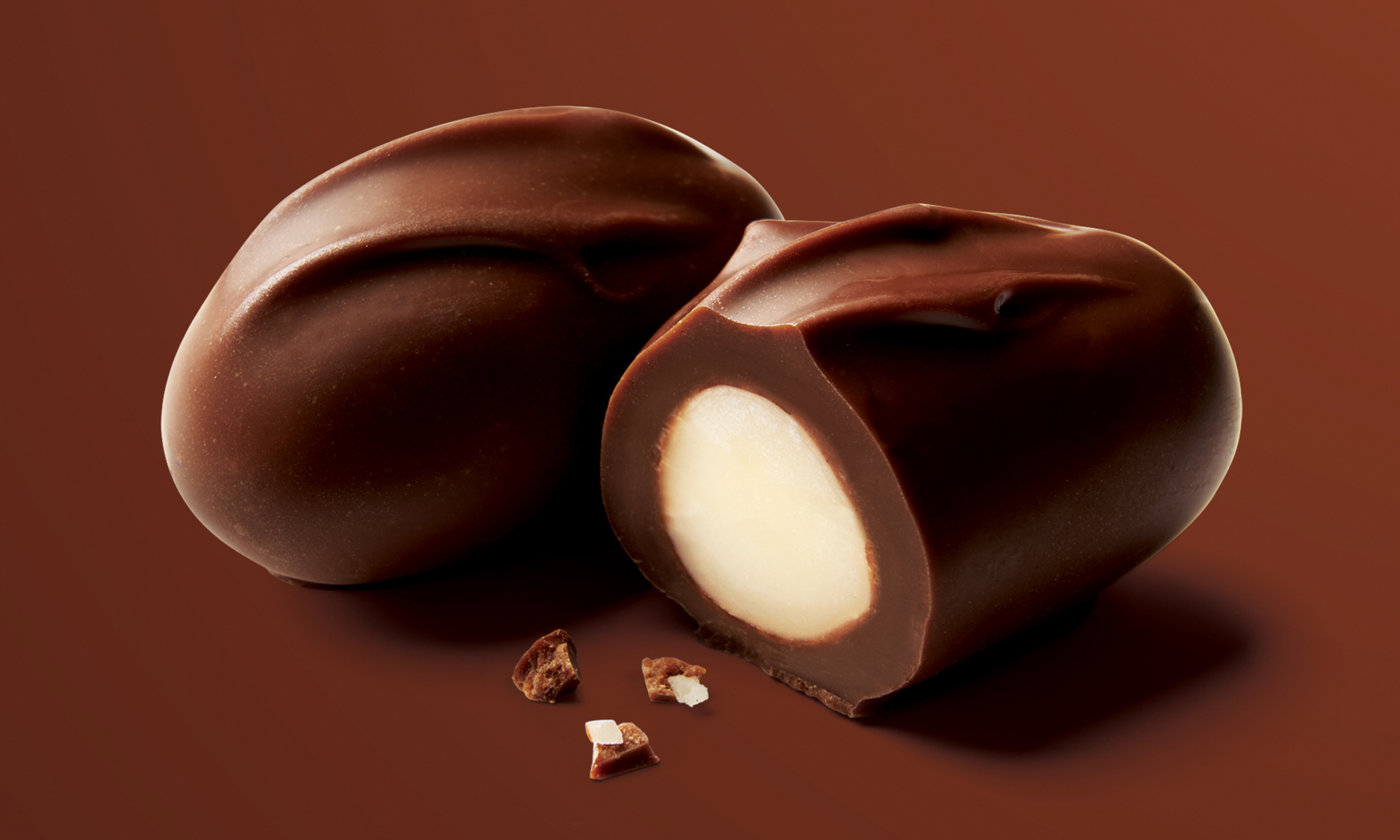
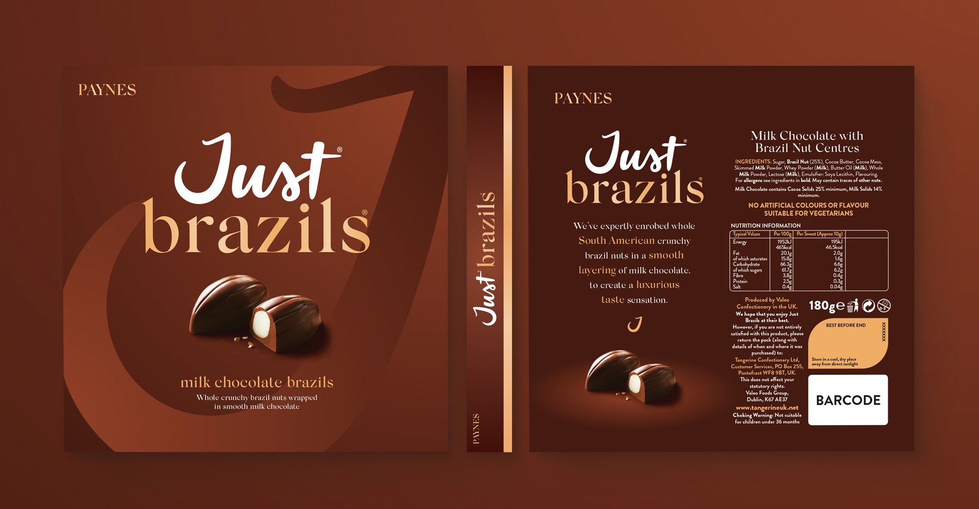
The Result
Elevating Just Brazils to a luxury offering with a reimagined logo – a sleek ‘J’ that mirrors the elegant curve of a Brazil nut and a chocolate drop. This refined identity, highlighted through expert photography and retouching, positions Just Brazils as the premium choice for indulgent nut connoisseurs.