


The Challenge
Revolutionise breakfast with a convenient and innovative option: Ready-Poached Eggs. The mission? Crafting packaging that not only showcased the product’s unique features but also shouted simplicity and ease, perfect for busy, health-conscious consumers craving a quick and nutritious morning meal. To top it off, the task was to also create a catchy and memorable brand name.
The Result
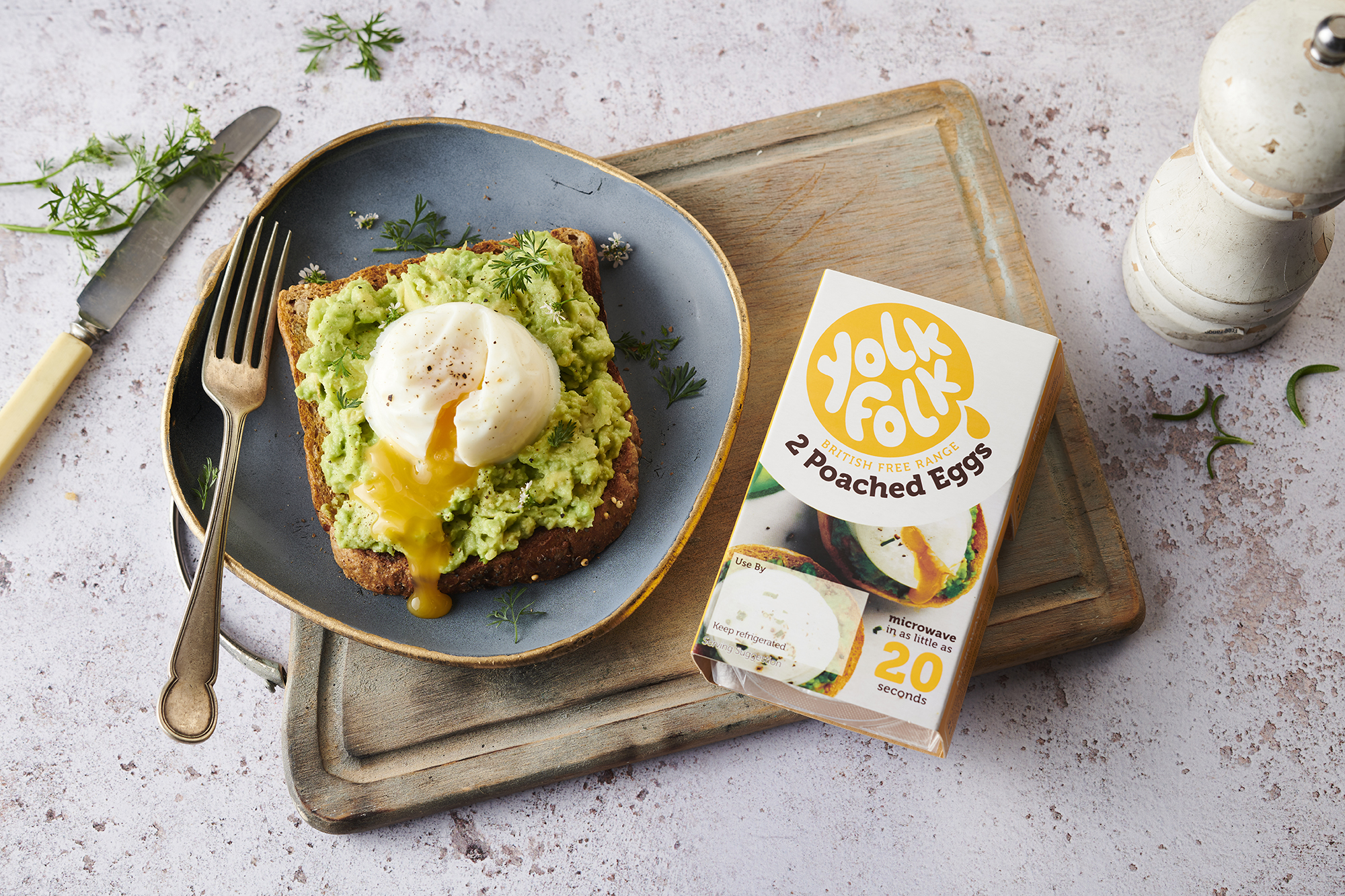
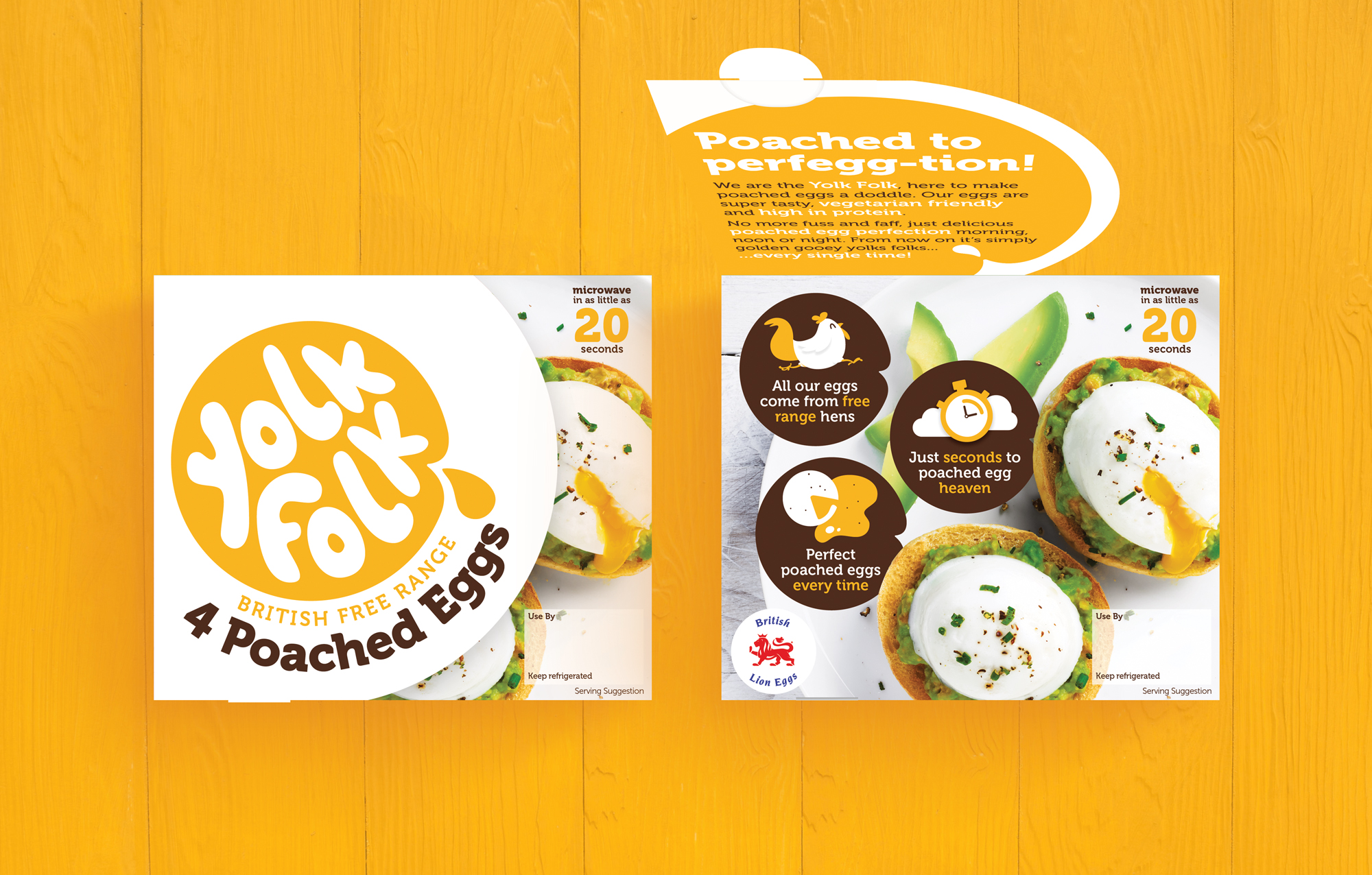
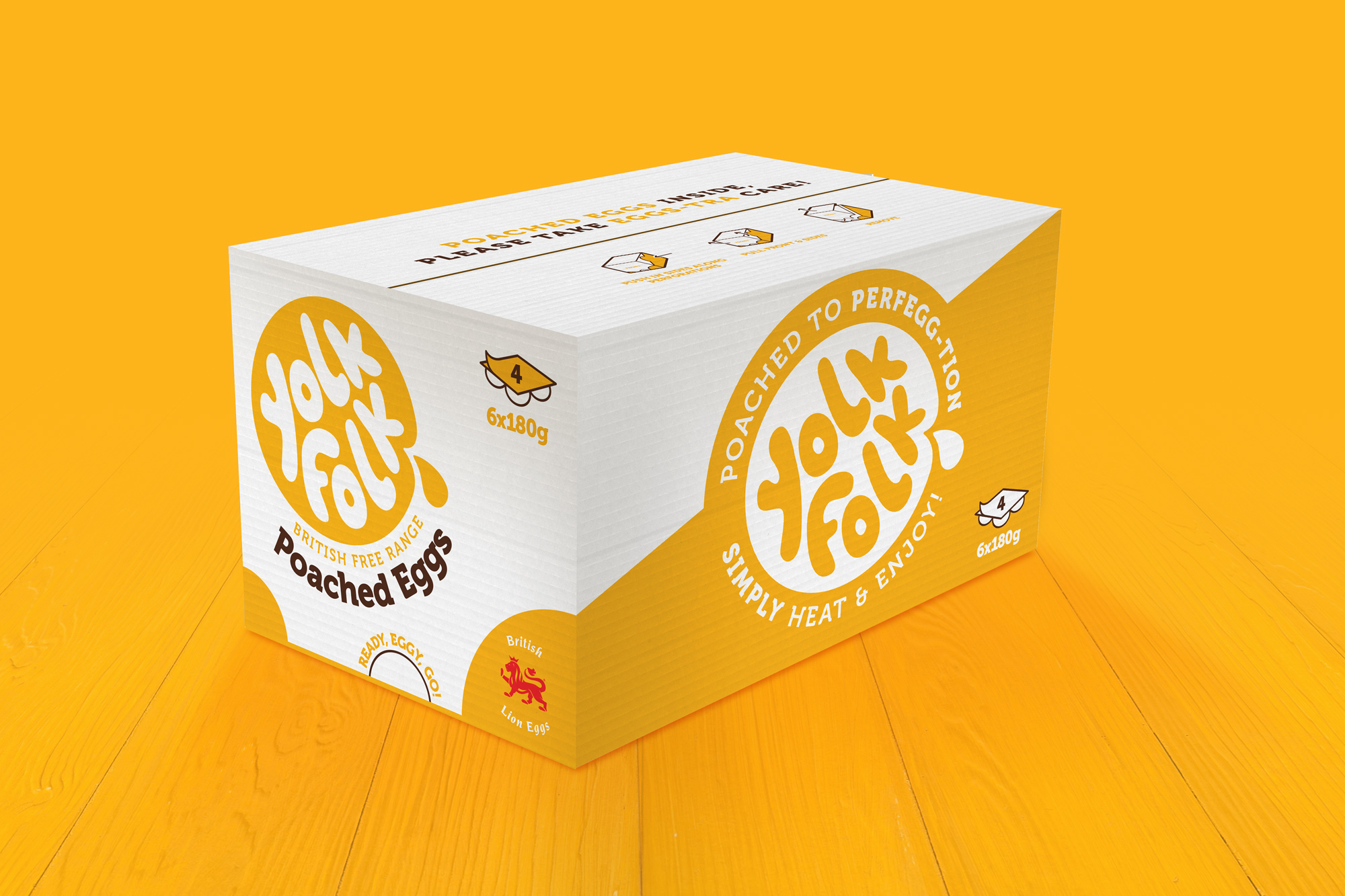
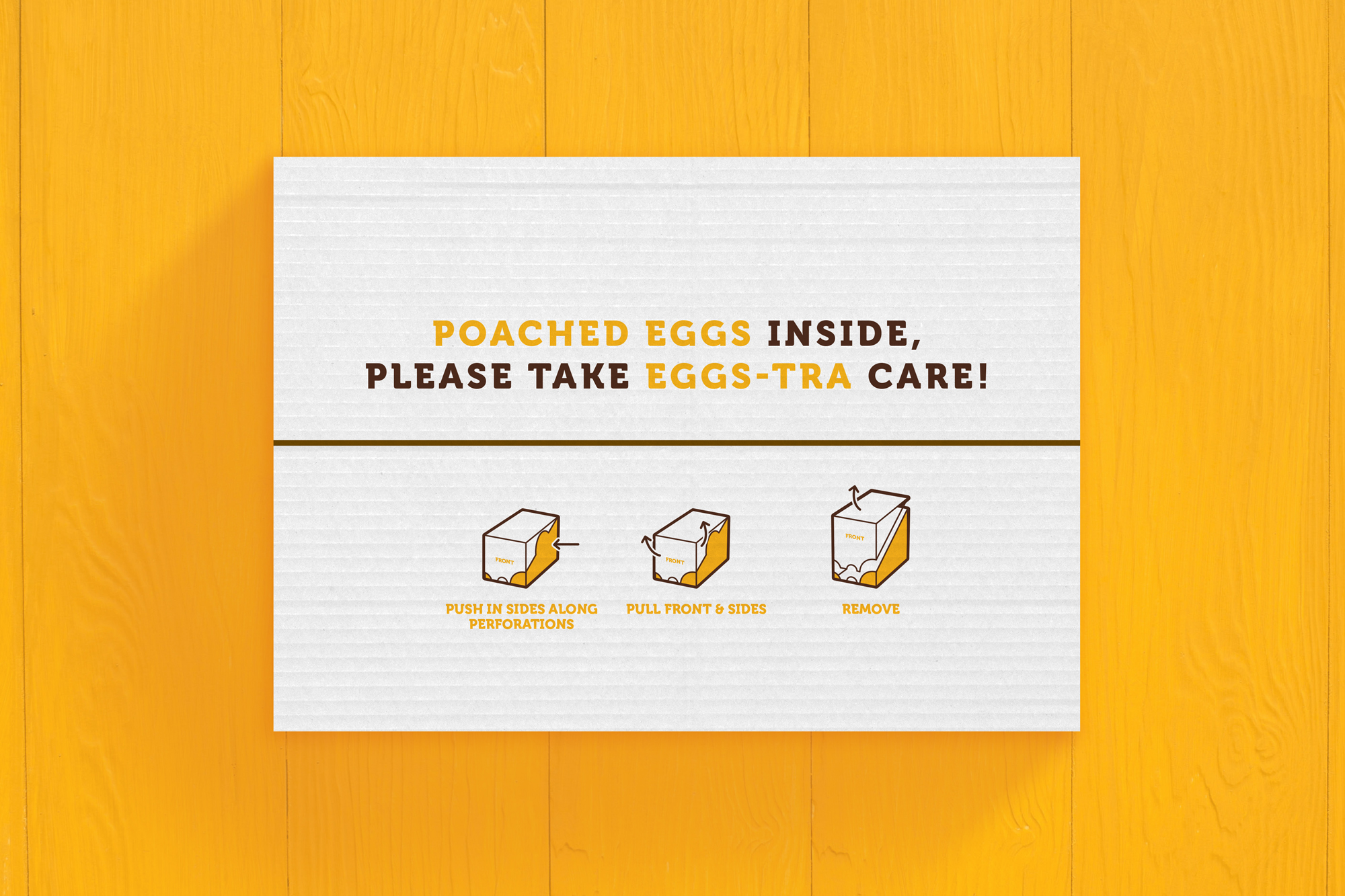
Inspired by the rustic charm of farm-to-fork produce and the warmth of local communities, “Yolk Folk” was hatched, capturing the essence of homegrown goodness and neighbourly spirit. The design identity reflects this ethos with a vibrant yellow yolk motif and a contemporary drip-style font. Laid against a stark white backdrop, the branding commands attention. The photography of the poached egg atop avocado on a toasted English muffin entices the senses with its mouth-watering appeal. To inject a playful touch, plenty of egg puns (“poached to perfegg-tion” and “just seconds to poached egg heaven”) were sprinkled in, infusing the packaging with irresistible charm.