


The Challenge
Seeking a significant transformation in their branding and packaging design, Perfectly Clear aimed to reinvigorate their range, aspiring for growth while establishing a stronger connection with families. In a market saturated with options, the challenge lay in creating a design that not only stood out on shelves but also effectively conveyed the product’s fruity, sugar-free essence amidst a sea of choices.
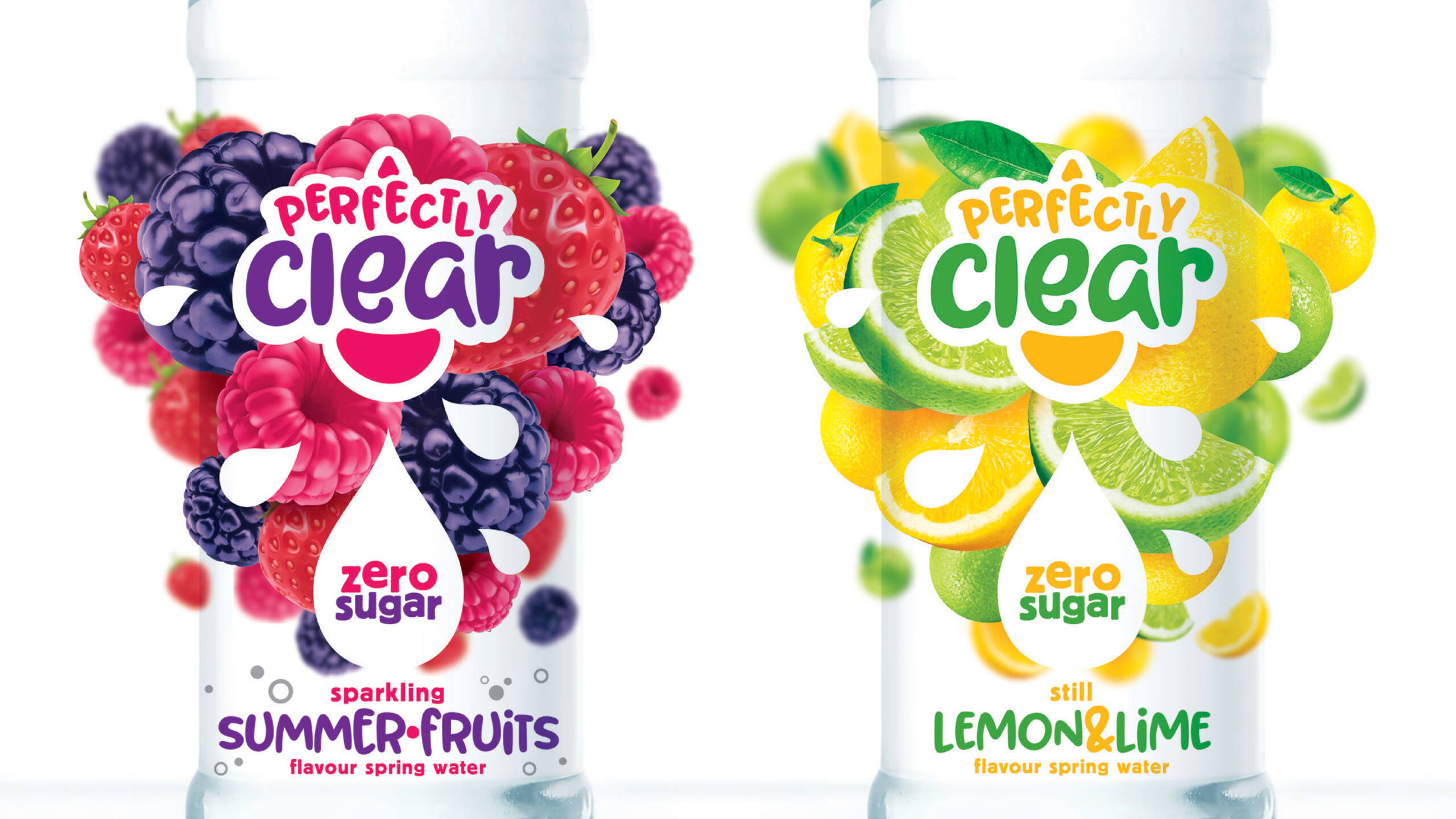
The Result
Infusing vibrancy and clarity into the brand’s identity involved meticulous refinement of its visual language, introducing a more playful typeface and enhancing the iconic water droplet motif. The packaging design strategy encapsulated the delightful flavour experience through whimsical fruit illustrations enveloping the bottles. This facilitated easy navigation for consumers and ensured unparalleled visibility on shelves.
The outcome of the collaborative efforts speaks volumes. Post-rebranding, Perfectly Clear witnessed remarkable year-on-year growth, a testament to the resonance of the design in capturing consumer attention and fostering brand loyalty. Immense pride is taken in contributing to their success, simplifying their message while amplifying their presence in the market.