

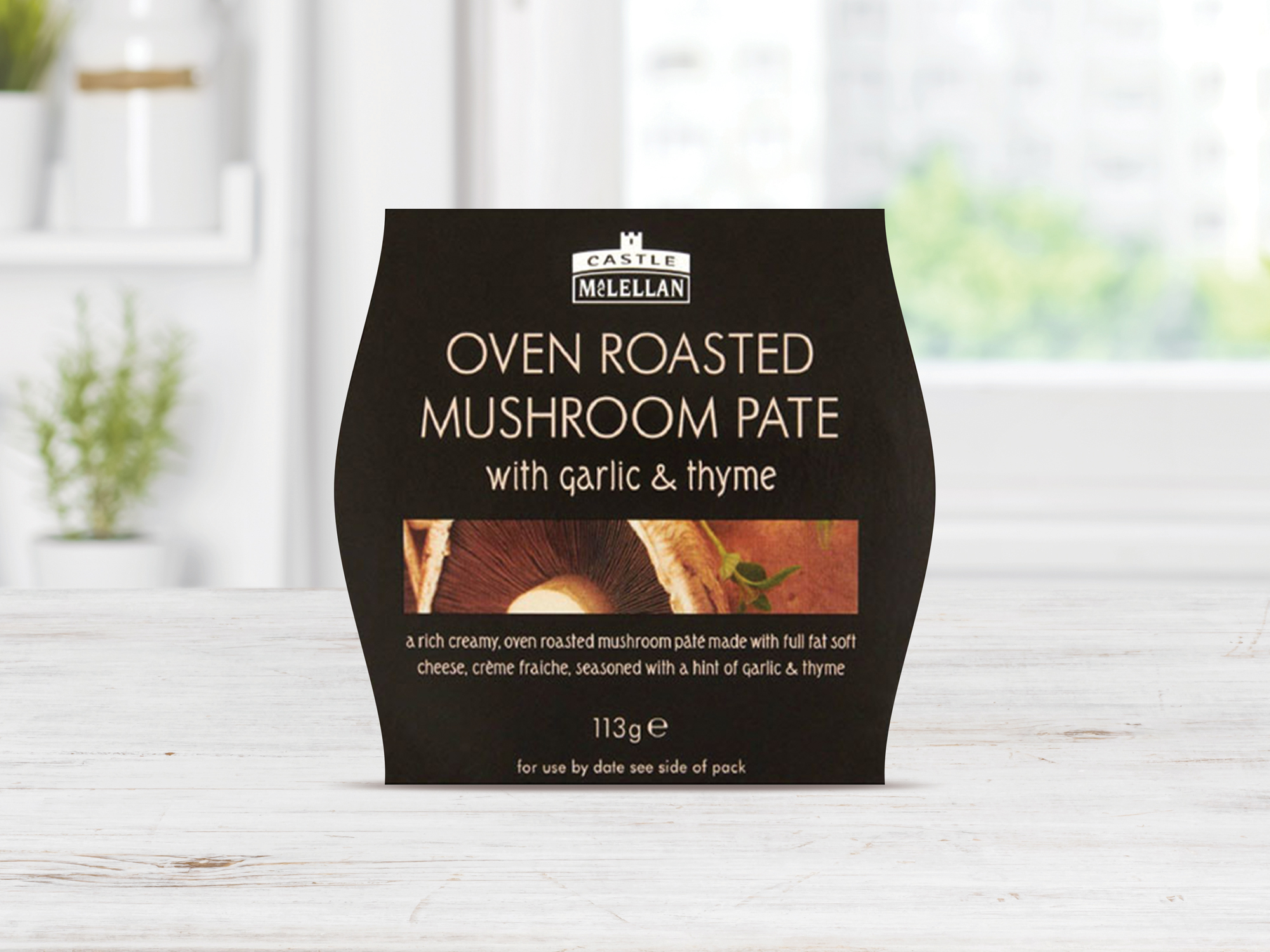
The Challenge
Create a new brand identity and packaging range redesign, while respecting Castle MacLellan’s heritage and reaffirming the provenance of their pâté.
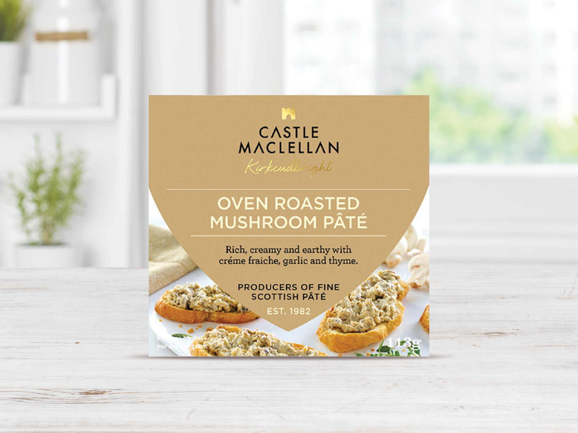
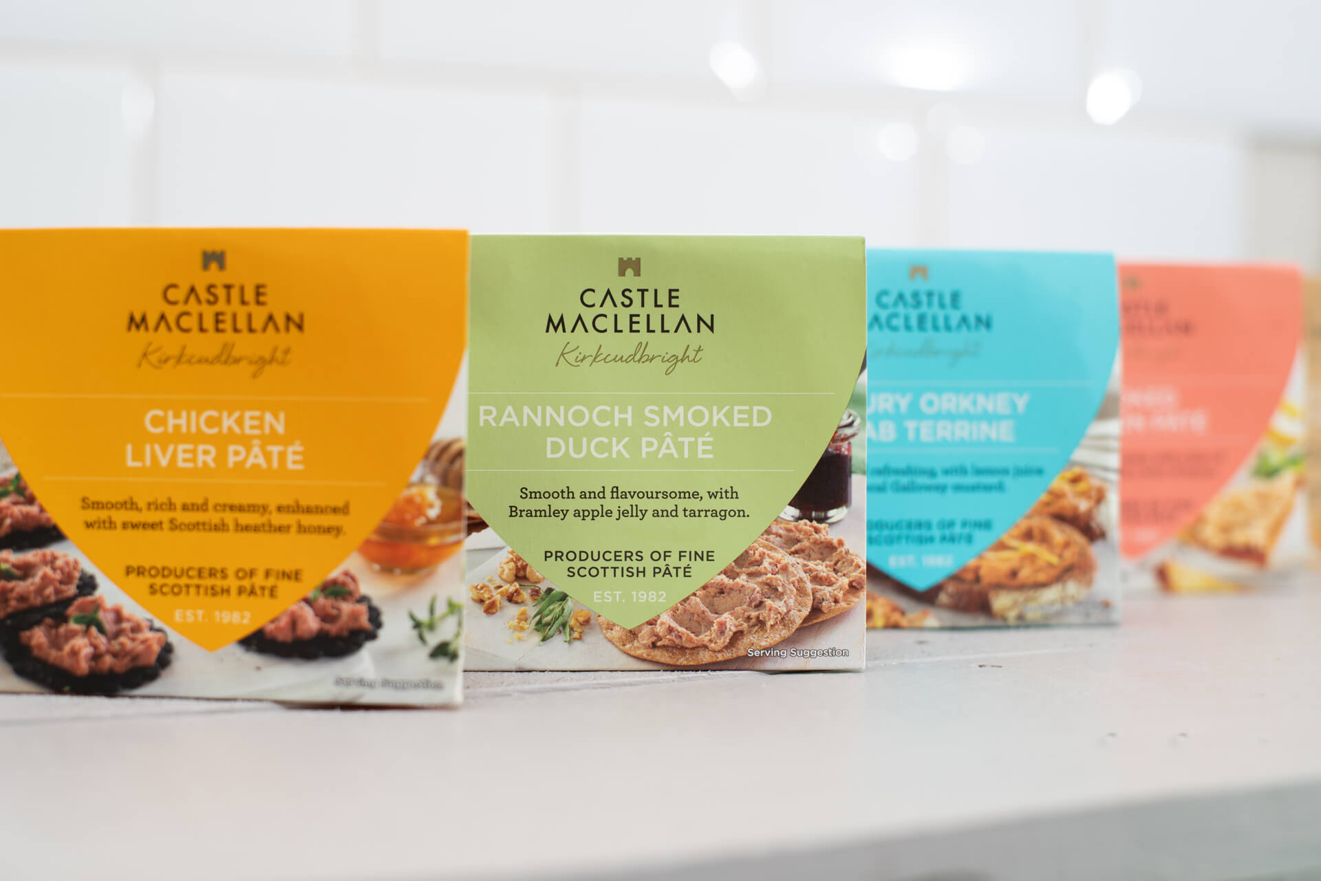
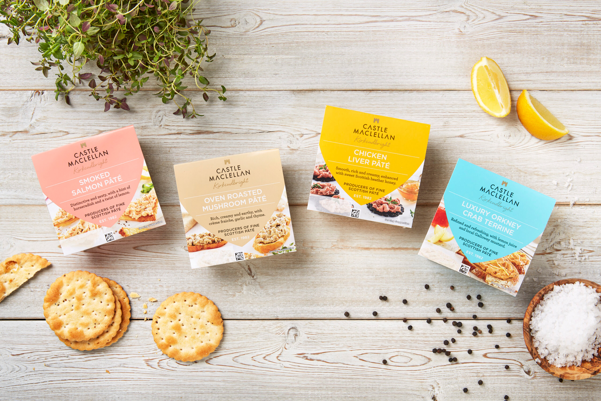
The Result
Displaying a distinctive custom typeface with subtle gold castle and ‘M’ ident, and a signature-style home town of ‘Kirkcudbright’ caption underscoring the new lock-up. Continuing the regal theme of the rebrand, a shield device was introduced to the packaging. Each of the five pâtés was given a different premium pastel colour, creating uniformity across the range, while helping customers to easily distinguish between the flavours.