![](https://andrewackroyd.co.uk/wp-content/uploads/2019/05/Flumps_Packaging_Design_Main-Logo.jpg)
![](https://andrewackroyd.co.uk/wp-content/uploads/2019/05/Flumps_Packaging_Design_Flumps-Pack-1-e1714850492793.jpg)
![](https://andrewackroyd.co.uk/wp-content/uploads/2019/05/Flumps_Packaging_Design_Sketch-.jpg)
![](https://andrewackroyd.co.uk/wp-content/uploads/2019/05/Flumps_Packaging_Design_Logo.jpg)
![](https://andrewackroyd.co.uk/wp-content/uploads/2019/05/Flumps_Packaging_Design_SRP.jpg)
![](https://andrewackroyd.co.uk/wp-content/uploads/2019/05/Designs_Flumps-Pack_Mini-Flimps-Trio.jpg)
The Challenge
In the realm of confectionery classics, Flumps stood as an icon of nostalgia, but its design needed a contemporary facelift. The challenge was clear: to redefine Flumps for the modern consumer while preserving its essence.
The Result
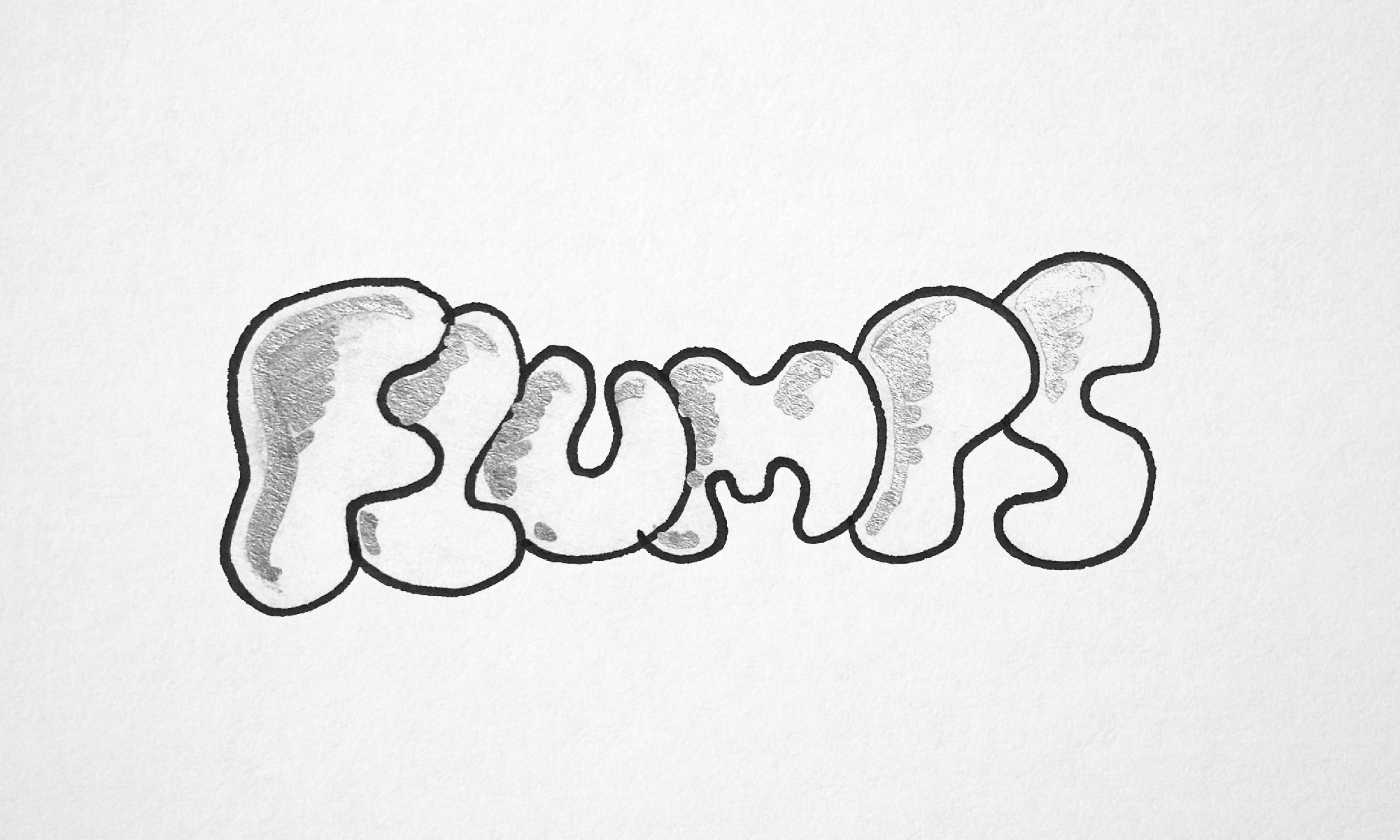
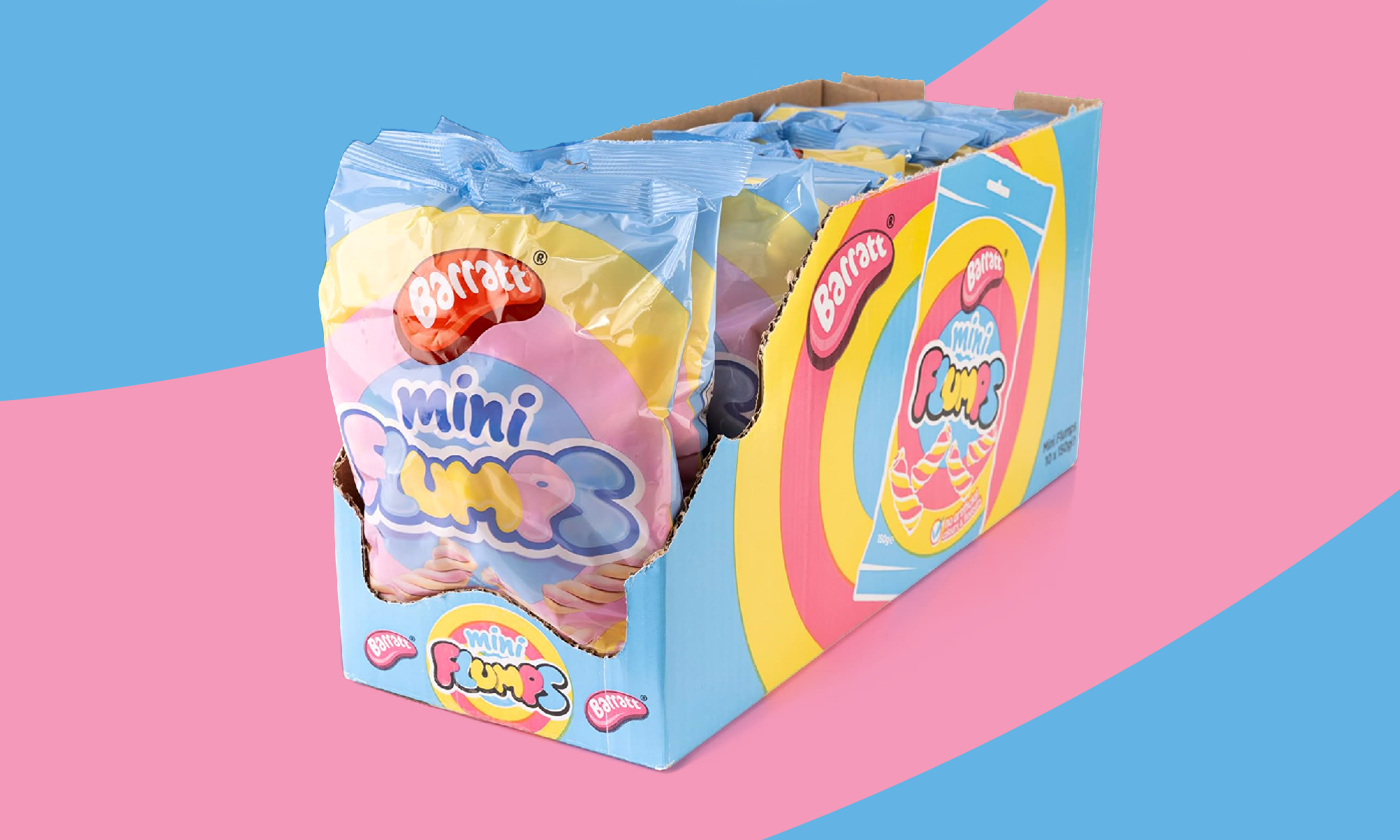
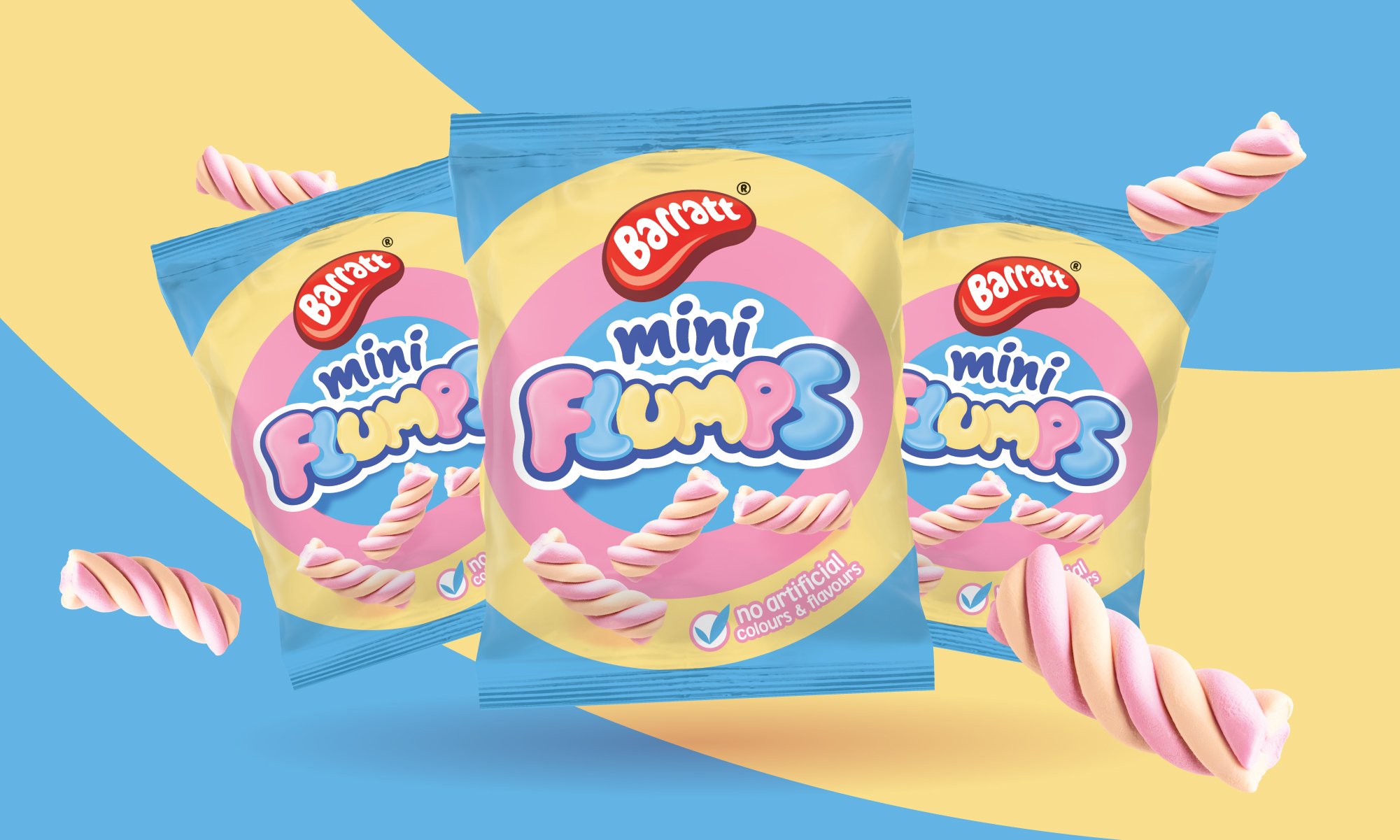
The culmination of this endeavour birthed a brand new identity for Flumps. Inspired by the softness and squishiness of the marshmallow itself, the design journey led to a logo that encapsulated these qualities. Pastel hues replaced the original tones, echoing the gentle allure of marshmallows. The result? A revitalised Flumps, ready to charm a new generation while honouring its timeless appeal.