The Challenge
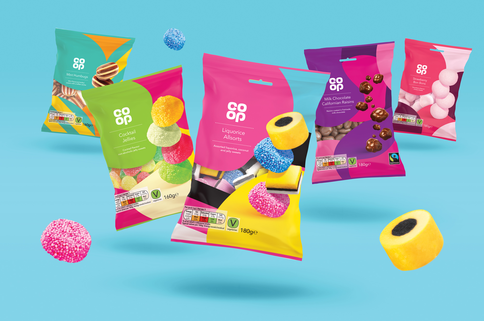
Co-op felt their existing confectionery design was outdated and in need of a refresh. The task was to breathe new life into their branding and packaging, infusing it with vibrancy and modernity while maintaining the traditional essence of their sweets.
The Result
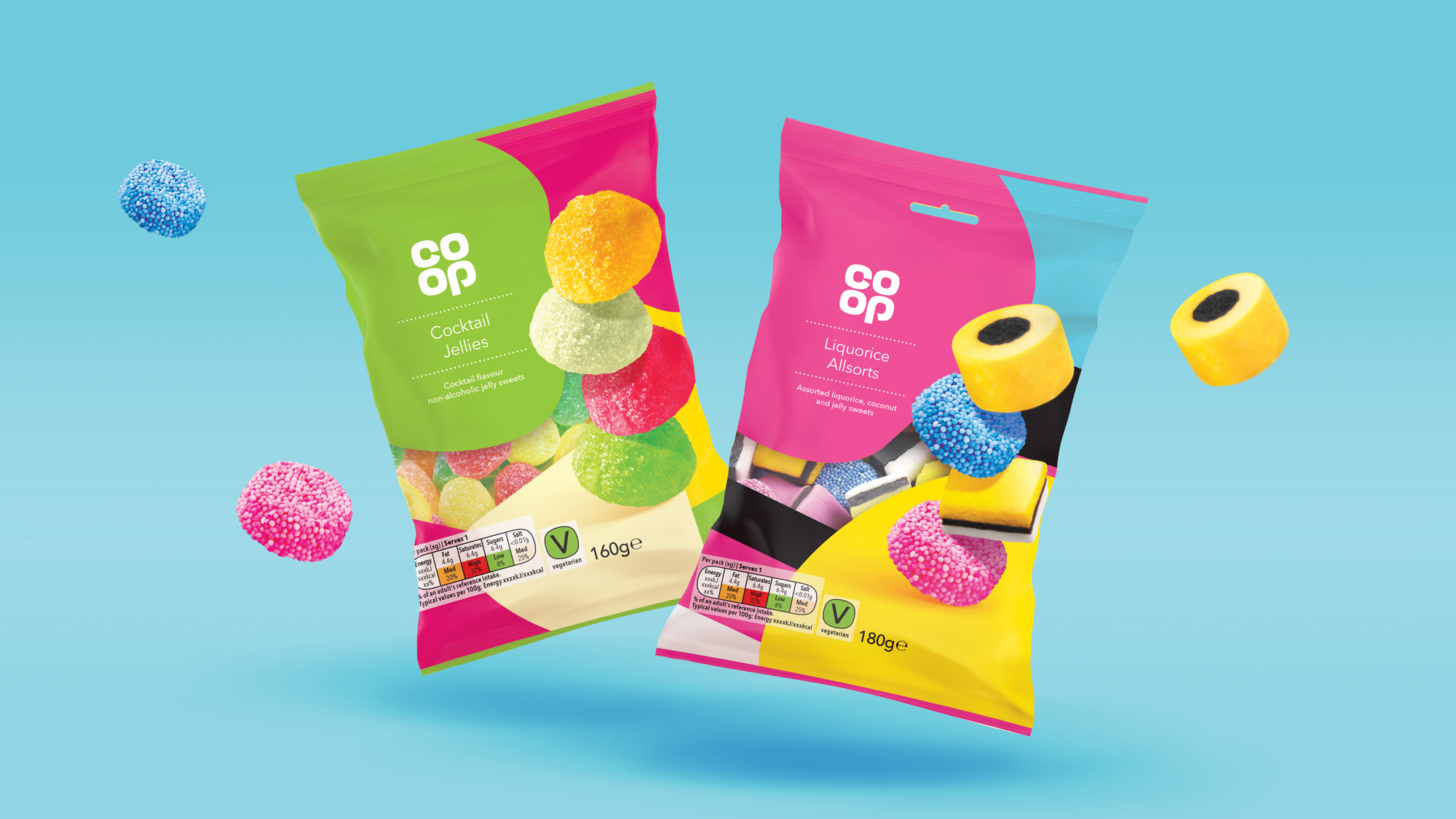
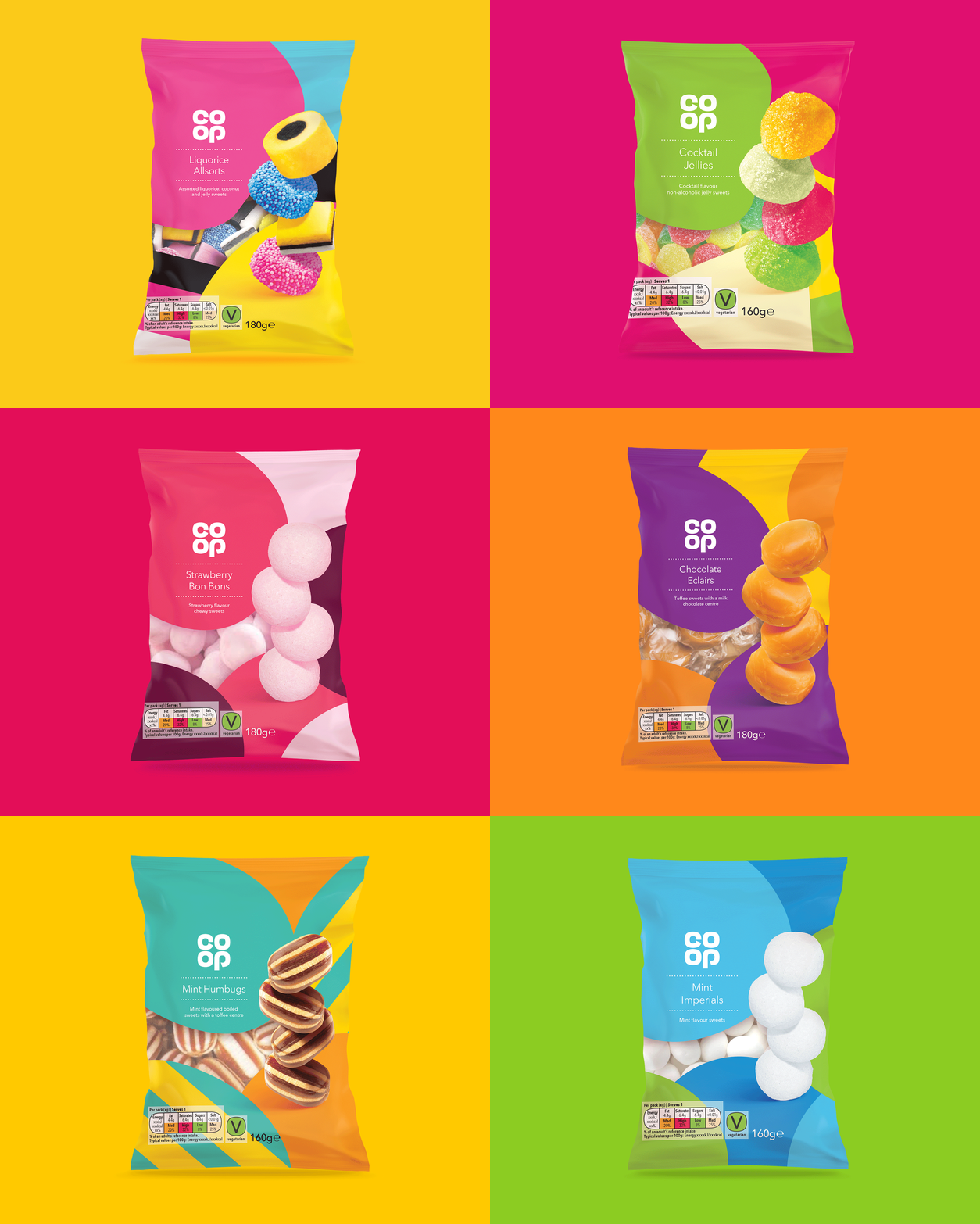
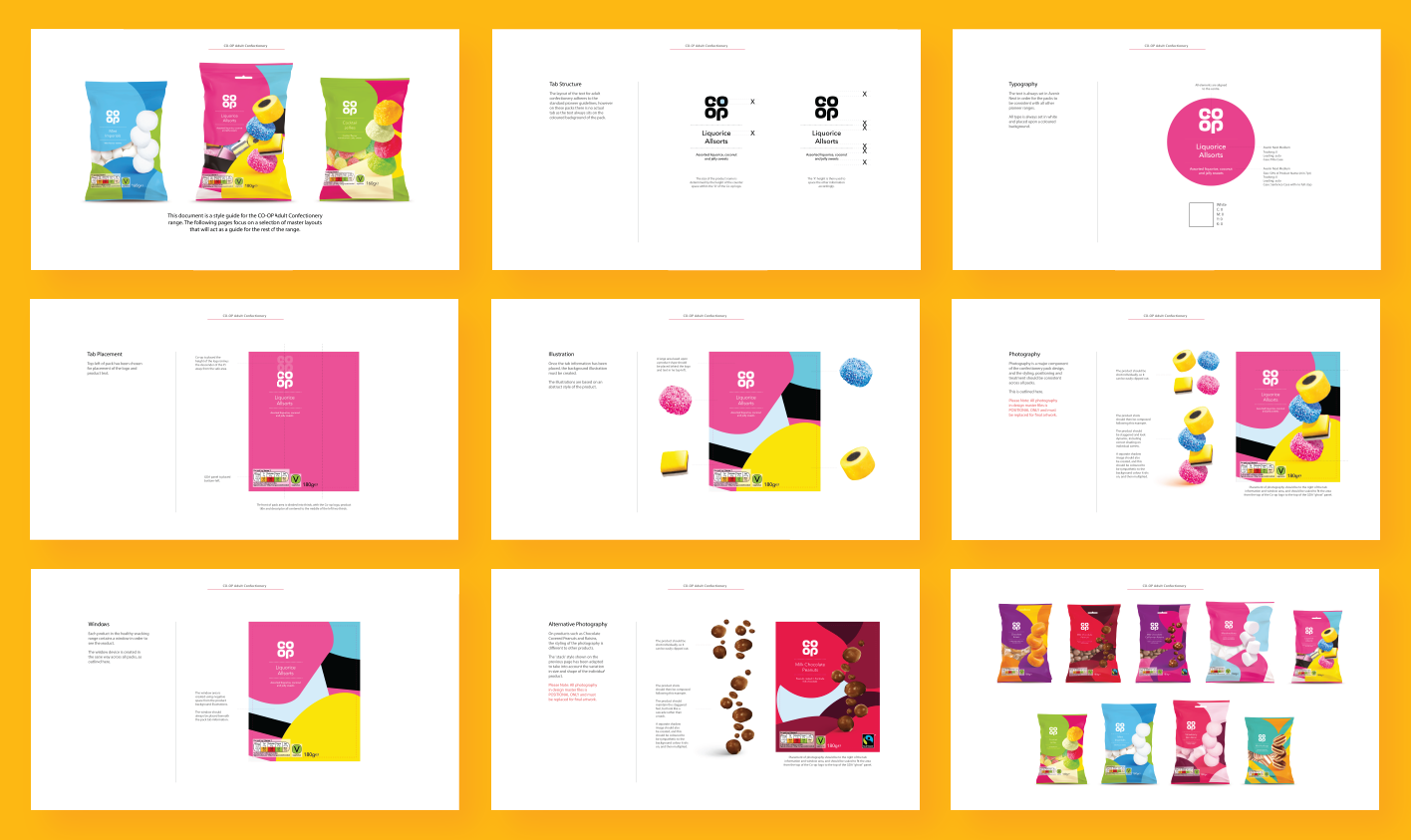
A vibrant and colourful design that revitalised Co-op Confectionery’s image, utilising large, eye-catching product photography of the sweets stacked in a quirky format, alongside a vibrant background illustration composed of blown-up images of the sweets. Crafting packaging that immediately captured attention on shelves, this refreshed look communicates the fun and mouth watering indulgence associated with these classic sweets, appealing to both loyal customers and new ones alike.
