The Challenge
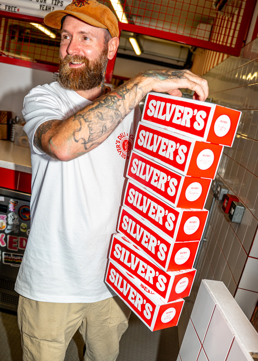
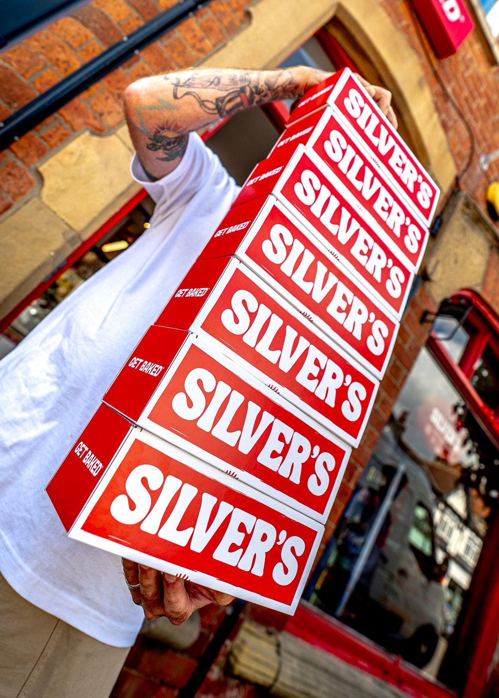
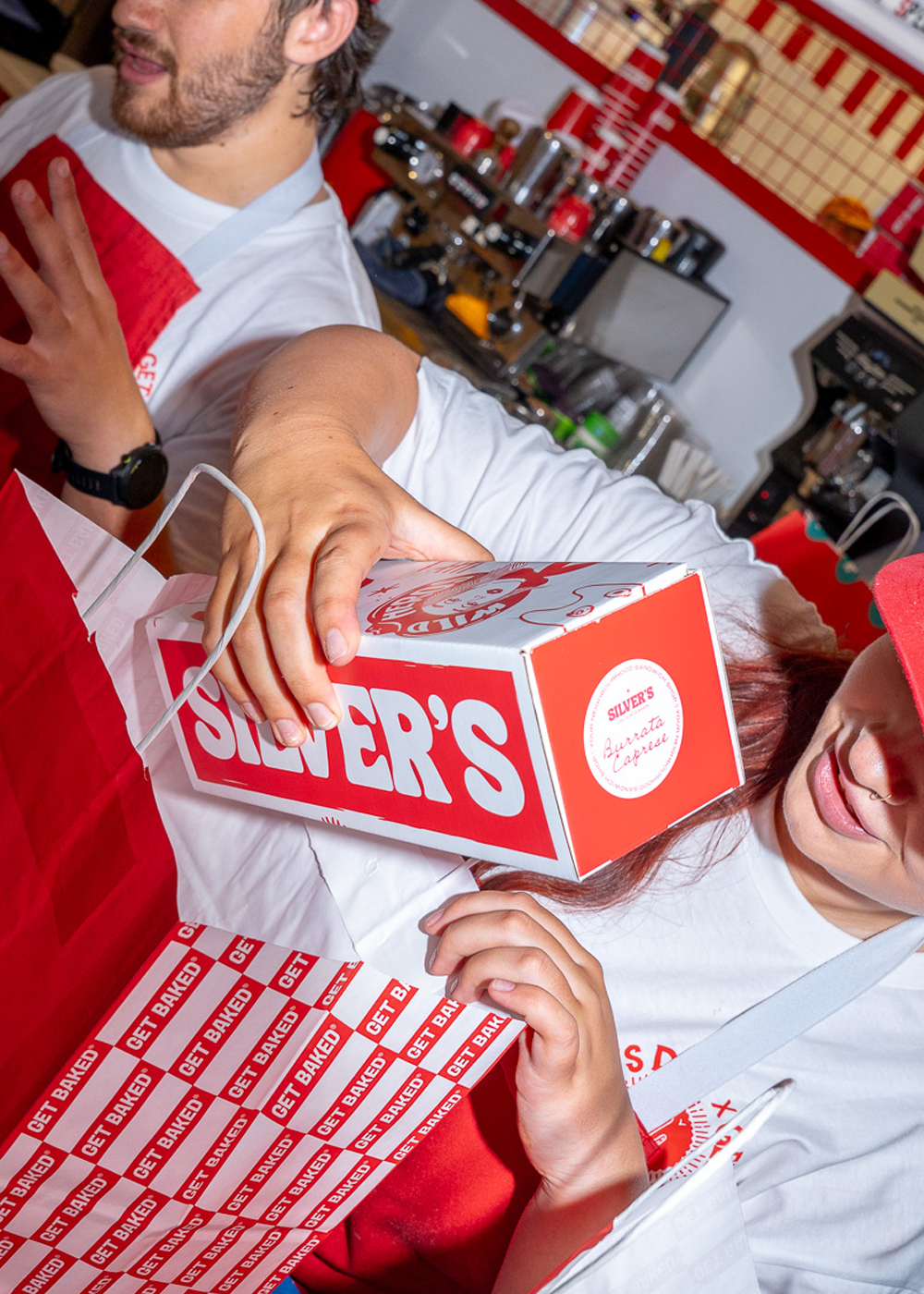
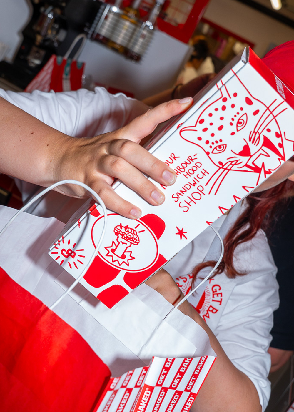
Silvers needed packaging that went beyond a simple sandwich box, something that could carry the brand’s playful, hand-drawn style while standing out in a fast-moving, high-volume food environment. The goal was to create a design that felt bold, engaging and unmistakably Silvers at a glance.
The Result
The finished box brings Silvers’ personality to life in a way that feels immediate and memorable. On counter, in hand, or on the street, it stands out instantly, turning everyday sandwiches into something people notice and talk about. The design strengthens brand recognition while staying flexible enough to sit across a fast-paced, high-volume food environment.
The Vision
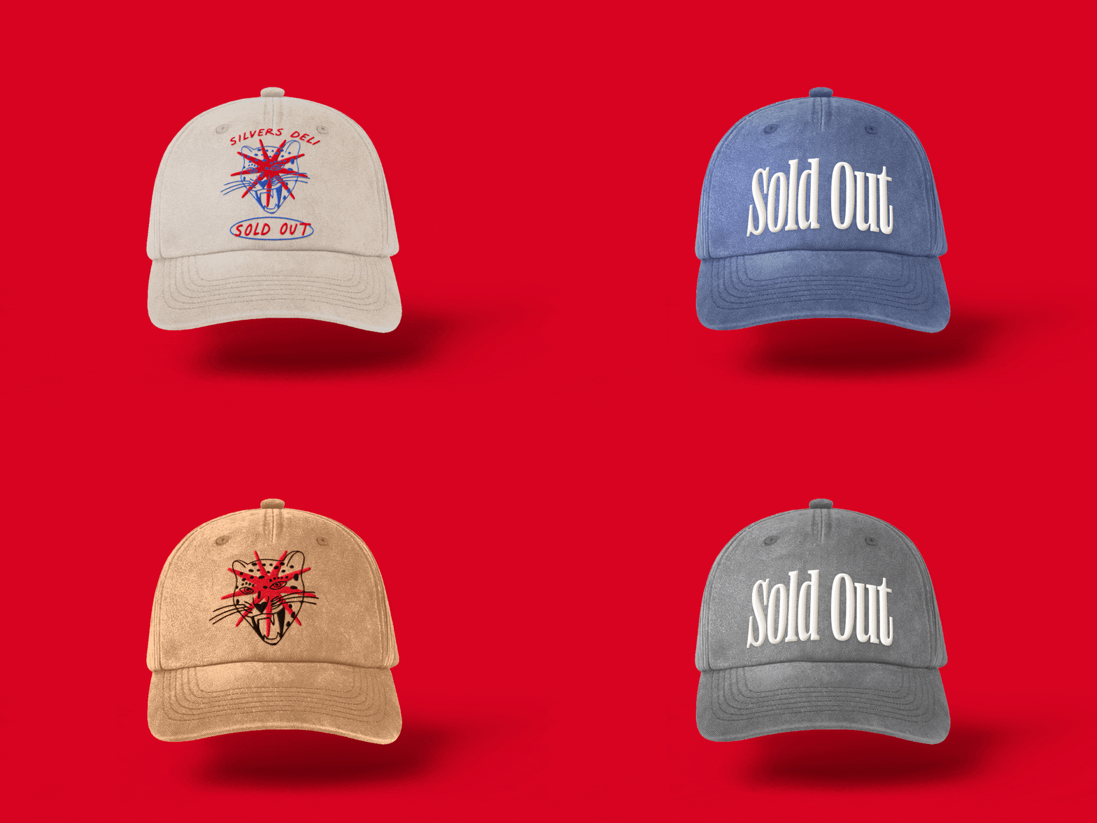
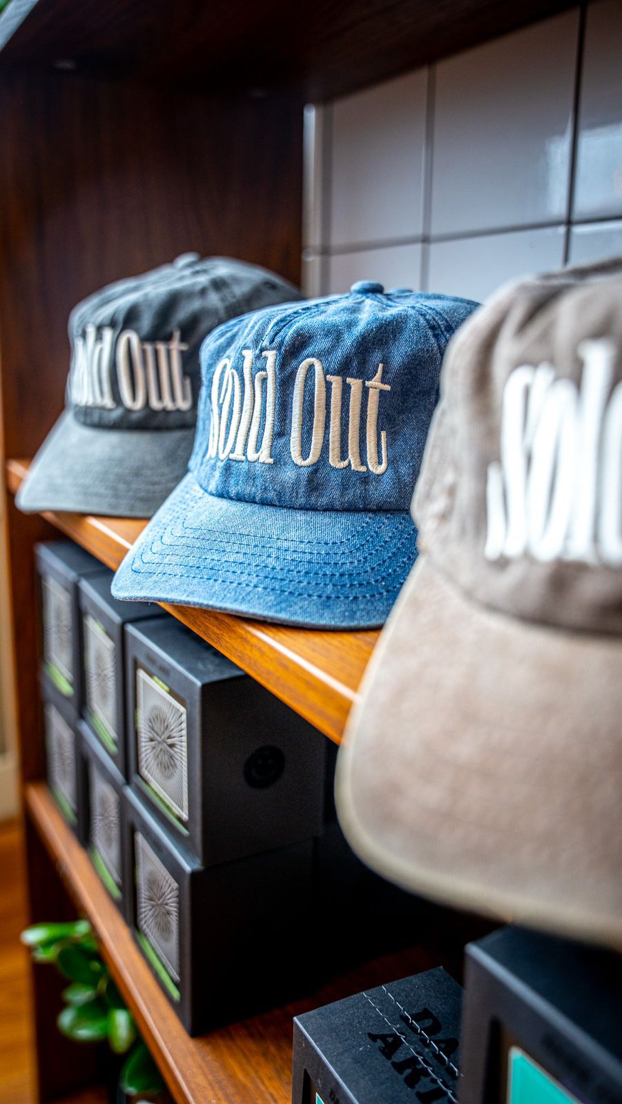
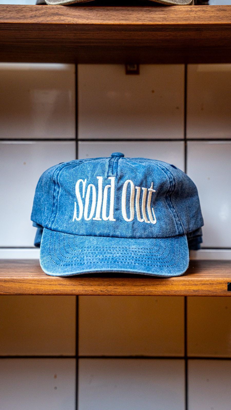
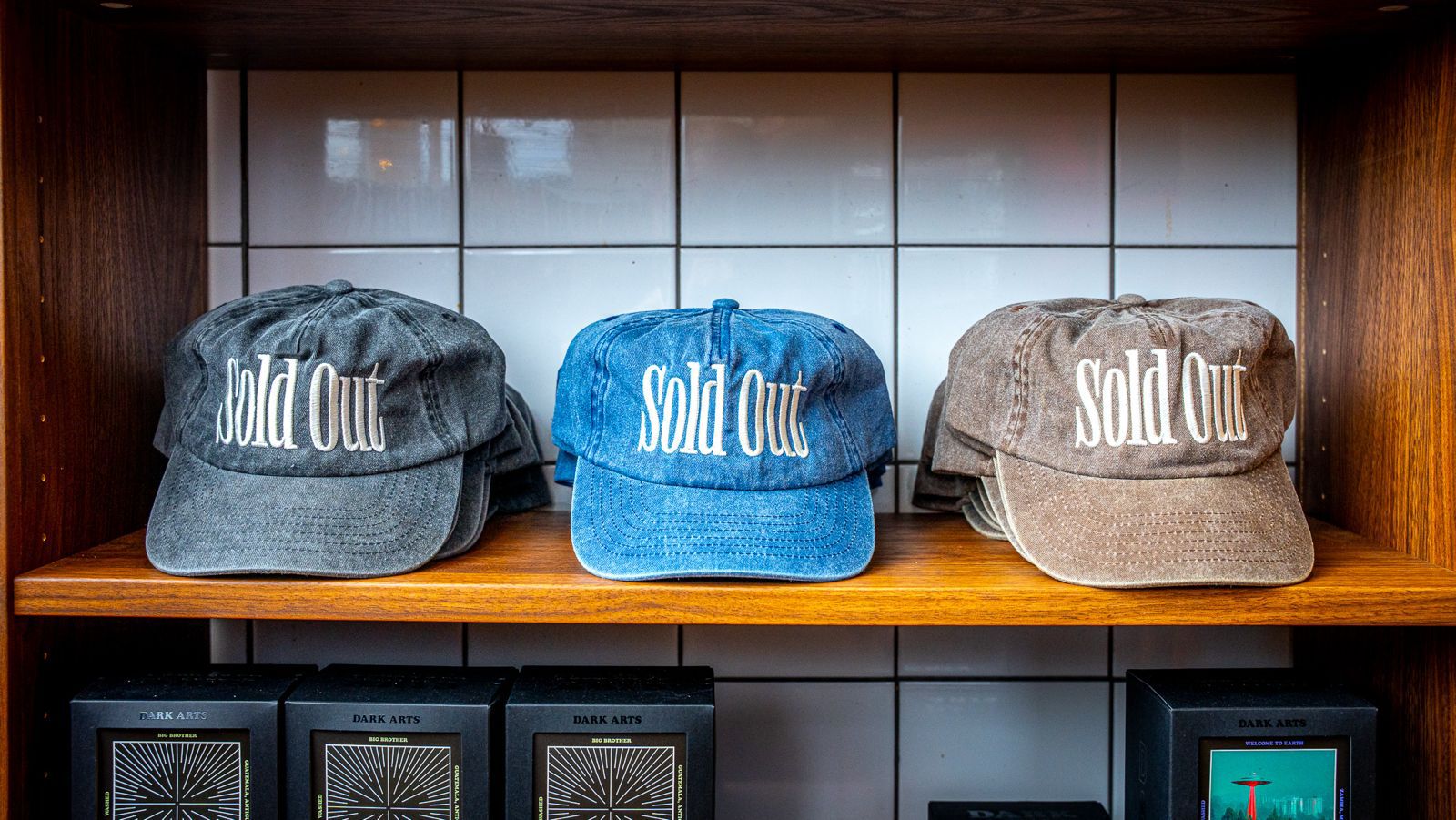
Silvers wanted merchandise that felt like an extension of the brand rather than a simple product. The caps needed to translate the deli’s playful, confident personality into wearable culture, featuring both the iconic “sold out” slogan and the cheetah and glint symbol. They had to feel bold, collectible and unmistakably Silvers, while remaining stylish enough for everyday wear.
The Statement
The caps became a standout piece of the Silvers merchandise range. Fans embraced them instantly, showcasing the brand’s graphics and slogan in a way that strengthened recognition and connection. Neutral tones make them versatile, while the bold branding ensures each cap is a small but powerful expression of Silvers’ personality.
